Soumya SUBBIREDDY
Home
About
RSPCA
Making animal care information trustworthy, findable, and return-worthy
A content and information architecture redesign to help users find reliable animal care information quickly — and return with confidence.
RSPCA Knowledge Base provides trusted information and support for animal care, adoption, and welfare. This project focused on improving content discoverability, readability, and user retention through a redesign of the Knowledge Base.
I designed a mobile-first Knowledge Base experience for RSPCA, with a focus on Content UX and Information Architecture.
Role
UX Designer (Content UX & IA)
Duration
2 months
Location
Melbourne, Australia
Methods
User interviews, contextual inquiry, UX audits, journey mapping, information architecture, interaction design, UX writing
Key Deliverables
- Mobile-first knowledge base experience
- Platform reframing proposal
- Impact–Effort prioritisation matrix
- Reusable article content template
User Impact
- Users could find and understand animal care information more quickly.
- Clear article structure and improved readability reduced cognitive load and made answers easier to locate.
Business Impact
- Improved content discoverability and search-first navigation increased the likelihood of repeat visits.
- The structured content system also supports long-term scalability for the RSPCA knowledge base.
Problem
Only 1 in 10 visitors returned, indicating that the RSPCA Knowledge Base functioned as a one-and-done answer tool rather than a trusted, engaging resource.
User interviews showed that while information was available, it wasn’t easy to use. Articles were dense, technical, and hard to scan, and the content structure didn’t match how users searched for answers.
Combined with a heuristic review and industry research, it became clear that poor findability and content hierarchy were key contributors to low trust and low return visits.
Key Insight
User interviews revealed that the term “Knowledge Base” felt impersonal and institutional.
This highlighted an opportunity to reframe the platform as guidance rather than documentation.
“Knowledge base sounds like information storage. Animal advice feels like support — like you’re here to guide me.”
User interview participant
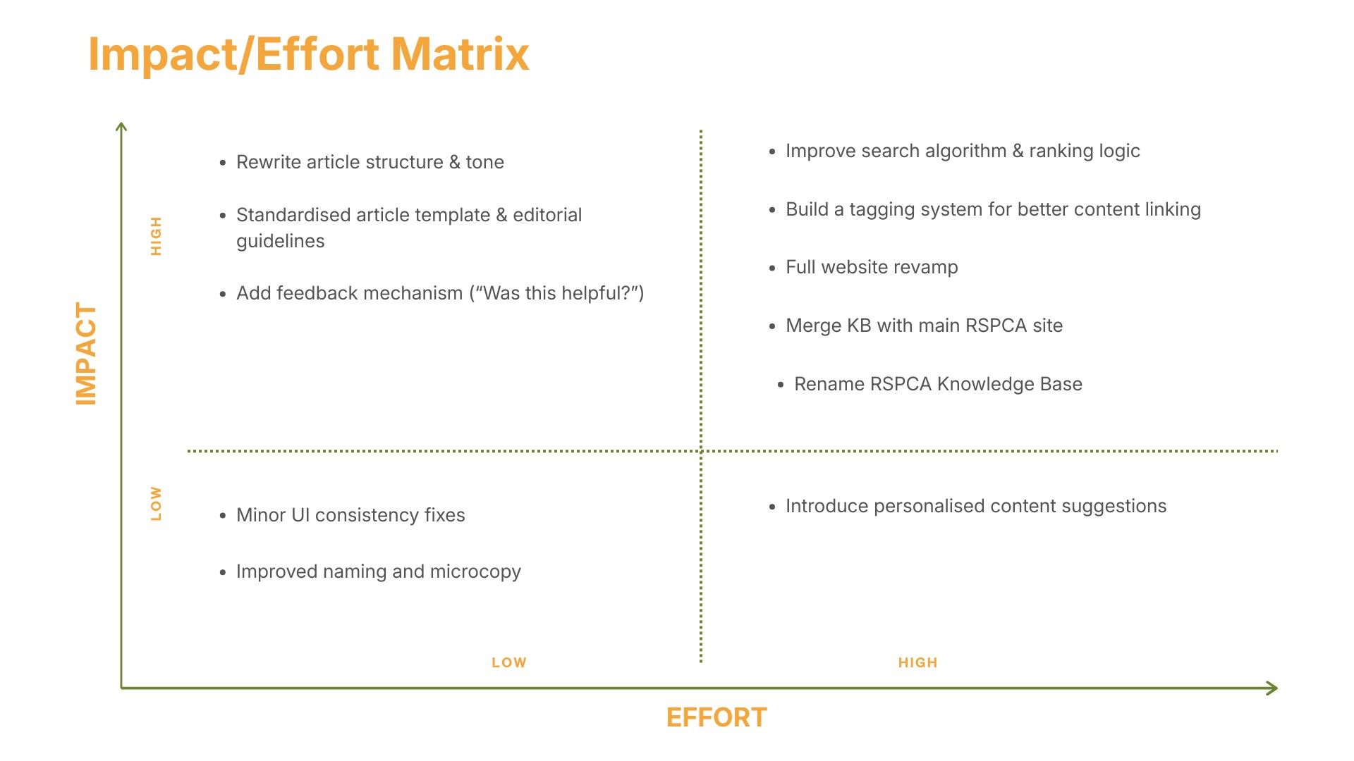
Prioritising Opportunities with an Impact–Effort Matrix
To identify which improvements would deliver the greatest value, I mapped potential changes using an Impact–Effort matrix.
This helped prioritise solutions that could significantly improve trust, discoverability, and usability while remaining realistic for implementation.
High-impact opportunities included:
• Introducing a search-first homepage
• Simplifying article structure for faster scanning
• Renaming the knowledge base to create a more supportive tone
This framework helped align design recommendations with both user needs and organisational constraints.
Design
Designing for trust, clarity, and fast answers
When seeking animal care or welfare information, users are often in urgent or emotionally charged situations and need a source they can trust.
The design approach prioritised
1. Trust through clarity
Content should feel supportive, readable, and authoritative.
2. Fast answers over browsing
Users arrive with urgent questions and need quick results.
3. Structure content for scanning
Articles should support rapid reading and decision-making.
Search was treated as the primary entry point, supported by a clear content structure and plain language to help users reach the right information with minimal effort.
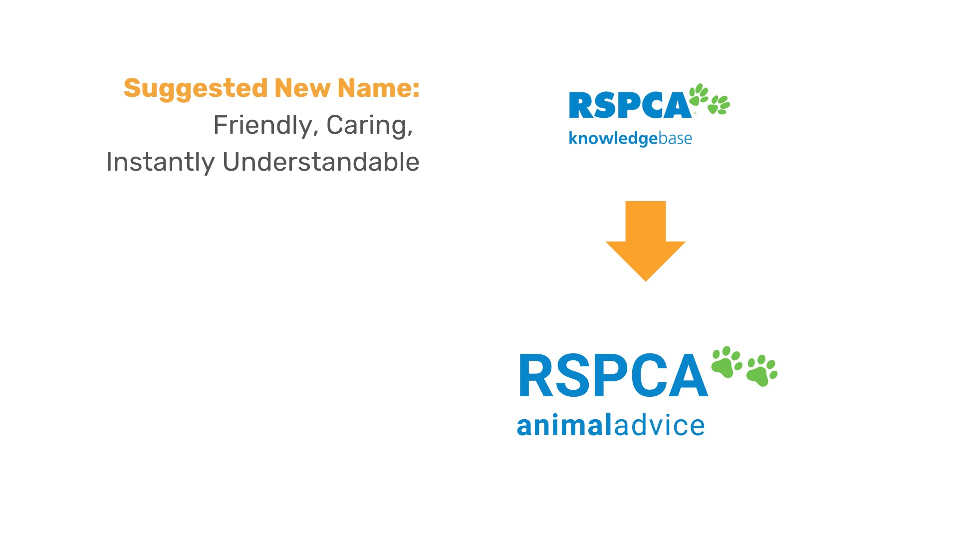
Renaming the Knowledge Base to “Animal Advice”
Early user interviews revealed that the term “Knowledge Base” felt technical and impersonal — more like information storage than support.
In contrast, “Animal Advice” signalled care, guidance, and approachability, which better matched users’ emotional state when seeking animal welfare information.
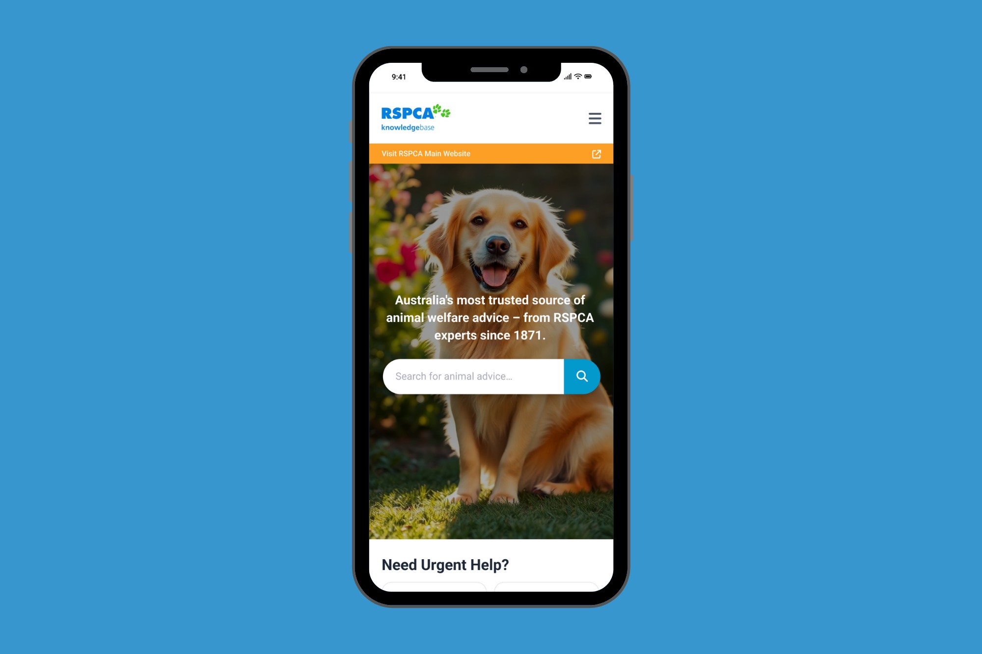
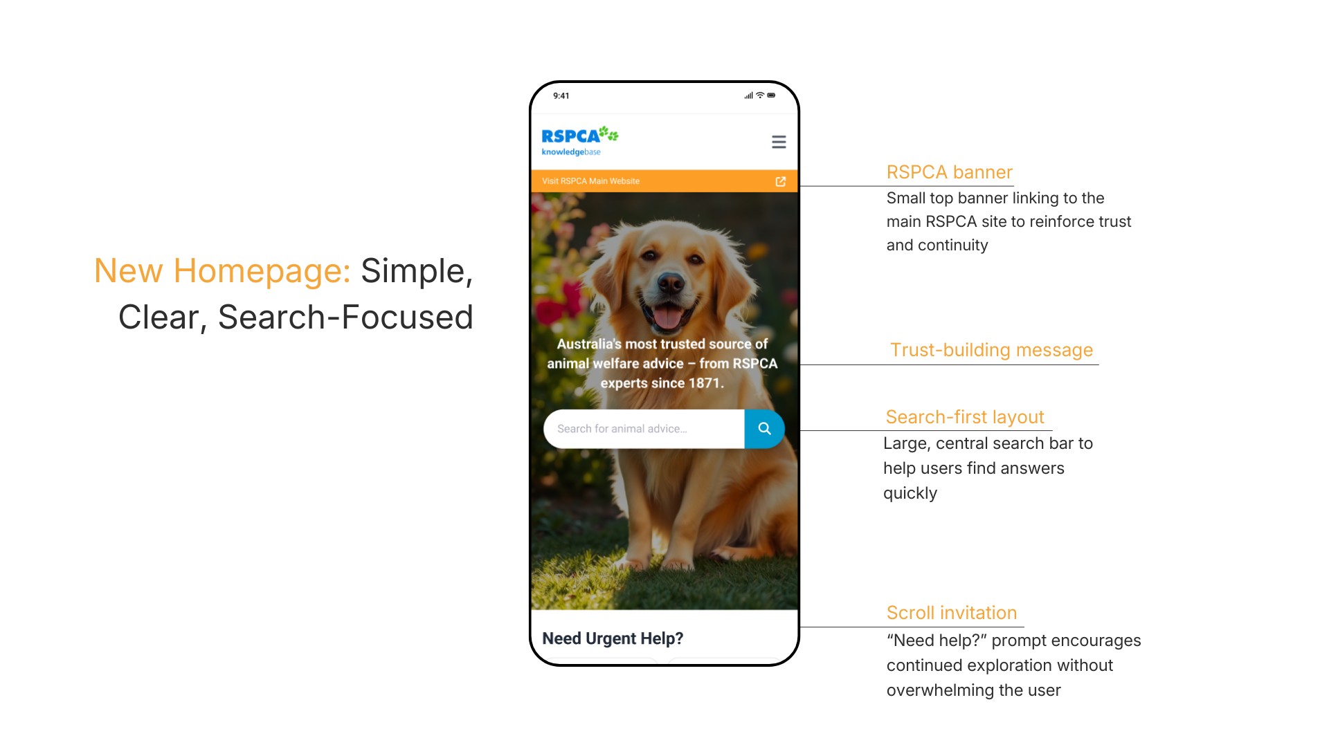
Search-first homepage
Users typically arrive at the RSPCA Knowledge Base with a specific, often urgent question about animal care. Prioritising search as the primary entry point reduces friction, supports fast answers, and aligns with how people naturally use knowledge bases.
Clear visual links to the main RSPCA site reinforce trust and continuity, helping users feel confident that this advice is part of a single, authoritative ecosystem.
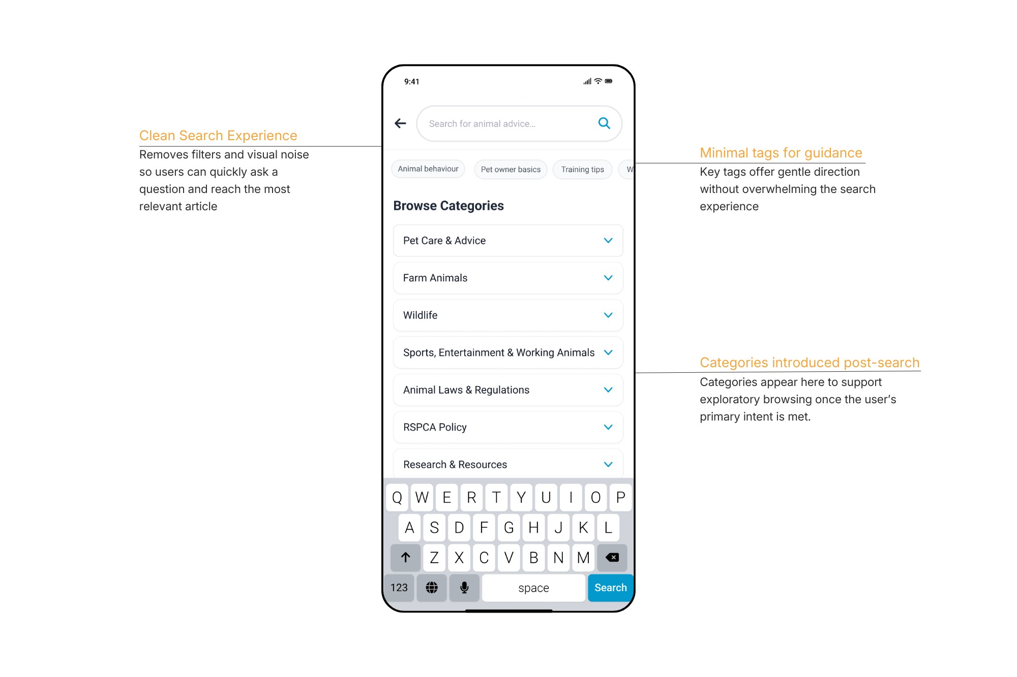
Once users choose to search, the experience shifts to a dedicated, distraction-free search space that supports both direct questions and light exploration.
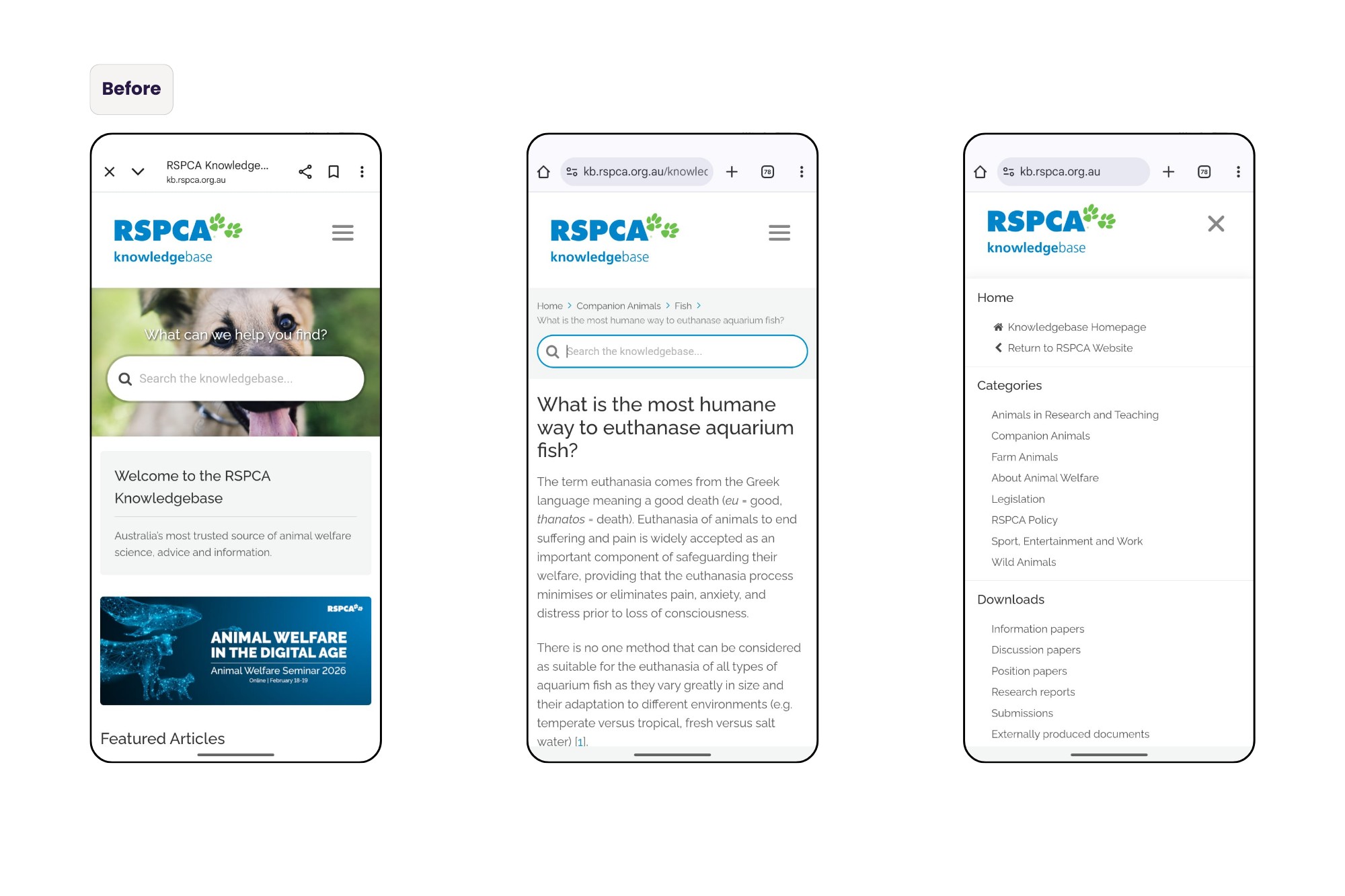
Clear Content Structure for Users and Search Visibility
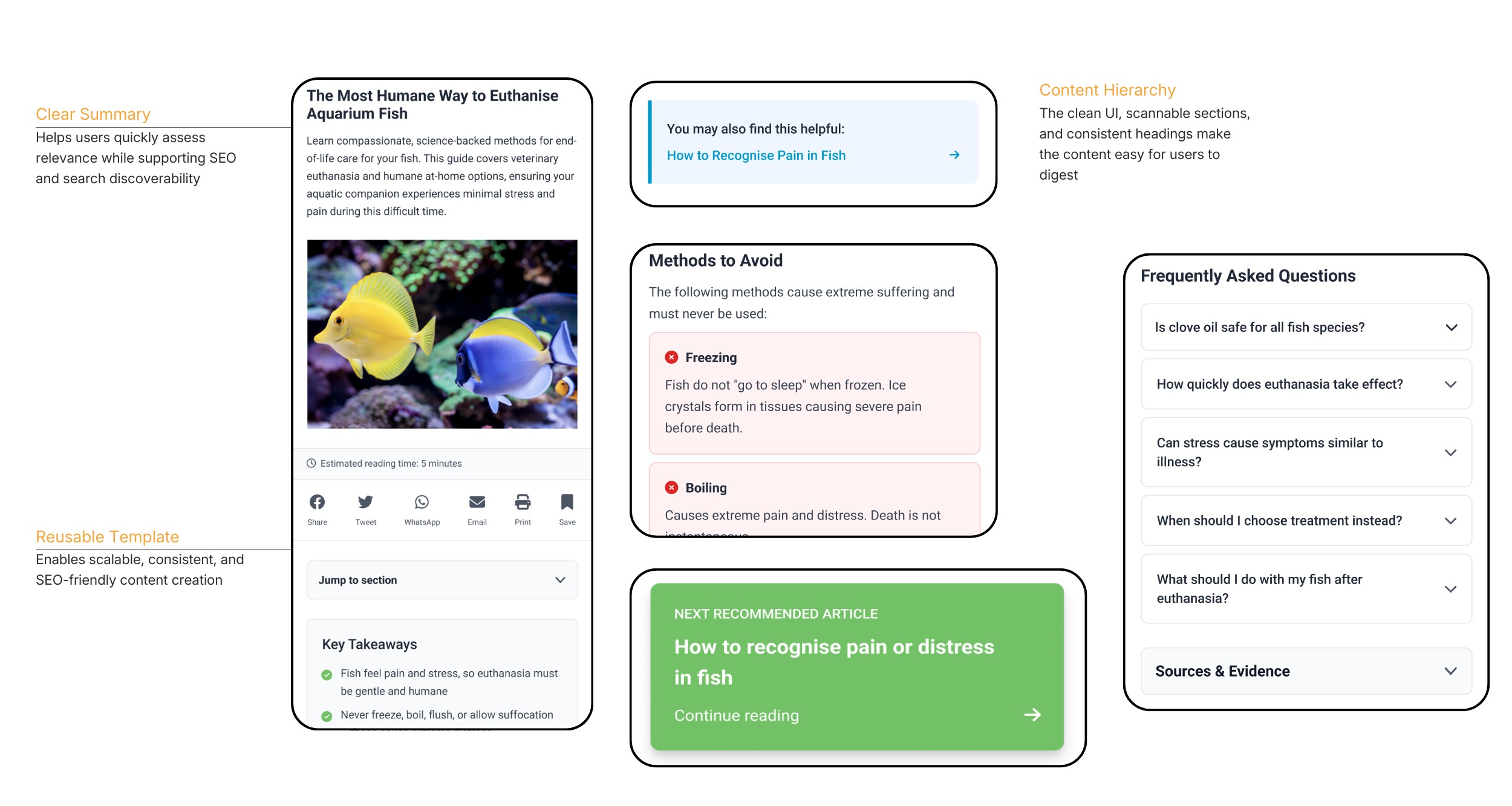
The article page was redesigned to support how people actually read animal welfare information — often quickly, emotionally, and under stress.
A clear summary, scannable sections, and consistent headings help users assess relevance early and find answers without reading the entire article.
The content was written in plain language and structured as a reusable template, making high-stakes advice easier to understand while improving SEO, consistency, and long-term scalability for the organisation.
Content Design System for Scannable Knowledge Articles
One key challenge identified during research was that many articles were dense, technical, and difficult to scan, making it hard for users to quickly find answers.
To address this, I designed a reusable content structure template that could be applied consistently across all articles in the knowledge base.
The template introduced:
• Clear summaries at the top of each article
• Structured sections with consistent headings
• Plain-language writing guidelines
• Scannable formatting to support quick reading
This system improves readability, discoverability, and user trust, while also creating a scalable framework for future content.
By aligning the structure with common search queries and user intent, the template also supports SEO optimisation and long-term content consistency for the organisation.
Testing
Users could quickly find and trust the information they needed
Usability validation and mentor reviews confirmed that users could find relevant information within a few clicks.
The redesigned information architecture and content hierarchy made navigation intuitive, while the rewritten articles were easier to read and understand.
The stakeholder specifically highlighted the clarity of the content structure and appreciated the strategic roadmap outlining how and when the changes could be implemented.
Retrospective
Design decisions emerge through iteration
While preparing the final prototype, I identified opportunities to reduce screen count and simplify flows. This reinforced that meaningful design decisions often surface late in the process — through testing, synthesis, and reflection — not only during initial planning.
Navigating ambiguity is part of the UX role
The project brief and stakeholder interviews revealed differing expectations, requiring careful synthesis of business goals and user insights to define the right focus. This experience strengthened my ability to navigate ambiguity, prioritise confidently, and present a clear direction — while recognising that not every recommendation will be implemented.
Soumya SUBBIREDDY
Home
About
RSPCA
Making animal care information trustworthy, findable, and return-worthy
A content and information architecture redesign to help users find reliable animal care information quickly — and return with confidence.
RSPCA Knowledge Base provides trusted information and support for animal care, adoption, and welfare. This project focused on improving content discoverability, readability, and user retention through a redesign of the Knowledge Base.
I designed a mobile-first Knowledge Base experience for RSPCA, with a focus on Content UX and Information Architecture.
Role
UX Designer (Content UX & IA)
Duration
2 months
Location
Melbourne, Australia
Methods
User interviews, contextual inquiry, UX audits, journey mapping, information architecture, interaction design, UX writing
Key Deliverables
- Mobile-first knowledge base experience
- Platform reframing proposal
- Impact–Effort prioritisation matrix
- Reusable article content template
User Impact
- Users could find and understand animal care information more quickly.
- Clear article structure and improved readability reduced cognitive load and made answers easier to locate.
Business Impact
- Improved content discoverability and search-first navigation increased the likelihood of repeat visits.
- The structured content system also supports long-term scalability for the RSPCA knowledge base.
Problem
Only 1 in 10 visitors returned, indicating that the RSPCA Knowledge Base functioned as a one-and-done answer tool rather than a trusted, engaging resource.
User interviews showed that while information was available, it wasn’t easy to use. Articles were dense, technical, and hard to scan, and the content structure didn’t match how users searched for answers.
Combined with a heuristic review and industry research, it became clear that poor findability and content hierarchy were key contributors to low trust and low return visits.
Key Insight
User interviews revealed that the term “Knowledge Base” felt impersonal and institutional.
This highlighted an opportunity to reframe the platform as guidance rather than documentation.
“Knowledge base sounds like information storage. Animal advice feels like support — like you’re here to guide me.”
User interview participant
Prioritising Opportunities with an Impact–Effort Matrix
To identify which improvements would deliver the greatest value, I mapped potential changes using an Impact–Effort matrix.
This helped prioritise solutions that could significantly improve trust, discoverability, and usability while remaining realistic for implementation.
High-impact opportunities included:
• Introducing a search-first homepage
• Simplifying article structure for faster scanning
• Renaming the knowledge base to create a more supportive tone
This framework helped align design recommendations with both user needs and organisational constraints.
Design
Designing for trust, clarity, and fast answers
When seeking animal care or welfare information, users are often in urgent or emotionally charged situations and need a source they can trust.
The design approach prioritised
1. Trust through clarity
Content should feel supportive, readable, and authoritative.
2. Fast answers over browsing
Users arrive with urgent questions and need quick results.
3. Structure content for scanning
Articles should support rapid reading and decision-making.
Search was treated as the primary entry point, supported by a clear content structure and plain language to help users reach the right information with minimal effort.
Renaming the Knowledge Base to “Animal Advice”
Early user interviews revealed that the term “Knowledge Base” felt technical and impersonal — more like information storage than support.
In contrast, “Animal Advice” signalled care, guidance, and approachability, which better matched users’ emotional state when seeking animal welfare information.
Search-first homepage
Users typically arrive at the RSPCA Knowledge Base with a specific, often urgent question about animal care. Prioritising search as the primary entry point reduces friction, supports fast answers, and aligns with how people naturally use knowledge bases.
Clear visual links to the main RSPCA site reinforce trust and continuity, helping users feel confident that this advice is part of a single, authoritative ecosystem.
Once users choose to search, the experience shifts to a dedicated, distraction-free search space that supports both direct questions and light exploration.
Clear Content Structure for Users and Search Visibility
The article page was redesigned to support how people actually read animal welfare information — often quickly, emotionally, and under stress.
A clear summary, scannable sections, and consistent headings help users assess relevance early and find answers without reading the entire article.
The content was written in plain language and structured as a reusable template, making high-stakes advice easier to understand while improving SEO, consistency, and long-term scalability for the organisation.
Content Design System for Scannable Knowledge Articles
One key challenge identified during research was that many articles were dense, technical, and difficult to scan, making it hard for users to quickly find answers.
To address this, I designed a reusable content structure template that could be applied consistently across all articles in the knowledge base.
The template introduced:
• Clear summaries at the top of each article
• Structured sections with consistent headings
• Plain-language writing guidelines
• Scannable formatting to support quick reading
This system improves readability, discoverability, and user trust, while also creating a scalable framework for future content.
By aligning the structure with common search queries and user intent, the template also supports SEO optimisation and long-term content consistency for the organisation.
Testing
Users could quickly find and trust the information they needed
Usability validation and mentor reviews confirmed that users could find relevant information within a few clicks.
The redesigned information architecture and content hierarchy made navigation intuitive, while the rewritten articles were easier to read and understand.
The stakeholder specifically highlighted the clarity of the content structure and appreciated the strategic roadmap outlining how and when the changes could be implemented.
Retrospective
Design decisions emerge through iteration
While preparing the final prototype, I identified opportunities to reduce screen count and simplify flows. This reinforced that meaningful design decisions often surface late in the process — through testing, synthesis, and reflection — not only during initial planning.
Navigating ambiguity is part of the UX role
The project brief and stakeholder interviews revealed differing expectations, requiring careful synthesis of business goals and user insights to define the right focus. This experience strengthened my ability to navigate ambiguity, prioritise confidently, and present a clear direction — while recognising that not every recommendation will be implemented.