Soumya SUBBIREDDY
Home
About
Youngster.co
Empowering young people through meaningful tech-enabled work
How a redesigned onboarding & session management experience helped young people show up, feel prepared, and stay motivated while supporting seniors with technology
Youngster.co is a social‑impact platform that connects college students and early‑career youngsters with seniors who need help navigating the digital world. While seniors gain confidence using technology, youngsters build job‑ready skills, confidence, and earn while studying.
In this project, I redesigned Youngster.co’s onboarding and session management experience—initially for web, later pivoted to a mobile‑first app—to reduce drop‑offs, improve preparedness, and increase session attendance.
Role
UX / Product Designer
Duration
2 months
Location
Melbourne, Australia
Methods
User interviews, contextual inquiry, field observation, UX audits, journey mapping, information architecture, interaction design, UX writing
Key Deliverables
- Onboarding redesign
- Session management system
- Messaging integration
- Mobile-first design
User Impact
- Clearer onboarding reduced confusion and improved trust.
- Youngsters now understand expectations before attending sessions.
- Bite-sized preparation content makes it easier to support seniors confidently.
Business Impact
- Better preparation reduces session cancellations.
- Highlighting incentives increases motivation and engagement.
- Integrated messaging simplifies coordination between teams.
Problem
Onboarding Was Breaking Trust
Youngsters struggled to understand how the platform worked before joining their first session.
Key issues included:
- The onboarding form asked for sensitive information (police check, address, personal details) before explaining why it was needed.
- The onboarding presentation was long and difficult to retain.
- New volunteers attended sessions unprepared.
- Communication and session management were fragmented across multiple tools.
For a user who is just exploring whether this opportunity is right for them, this created friction, anxiety, and fatigue
Research & Insight
What I Did
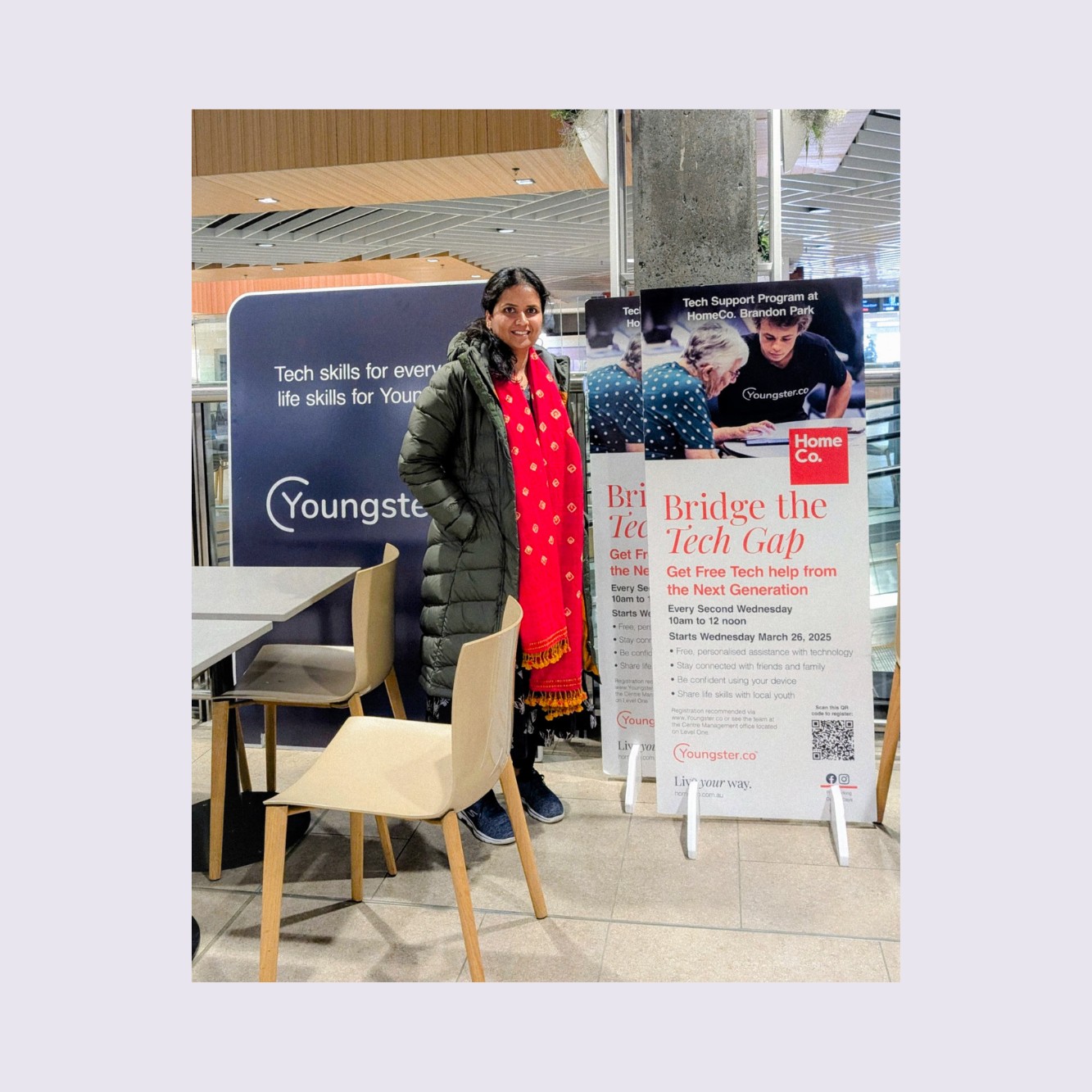
To understand the challenges firsthand, I went beyond the project brief and experienced the full journey myself.
- completed the entire onboarding process as a user
- attended a real session with seniors
- spoke directly with youngsters about their experiences
This helped me identify pain points that were not visible in the original brief.
What I Learned
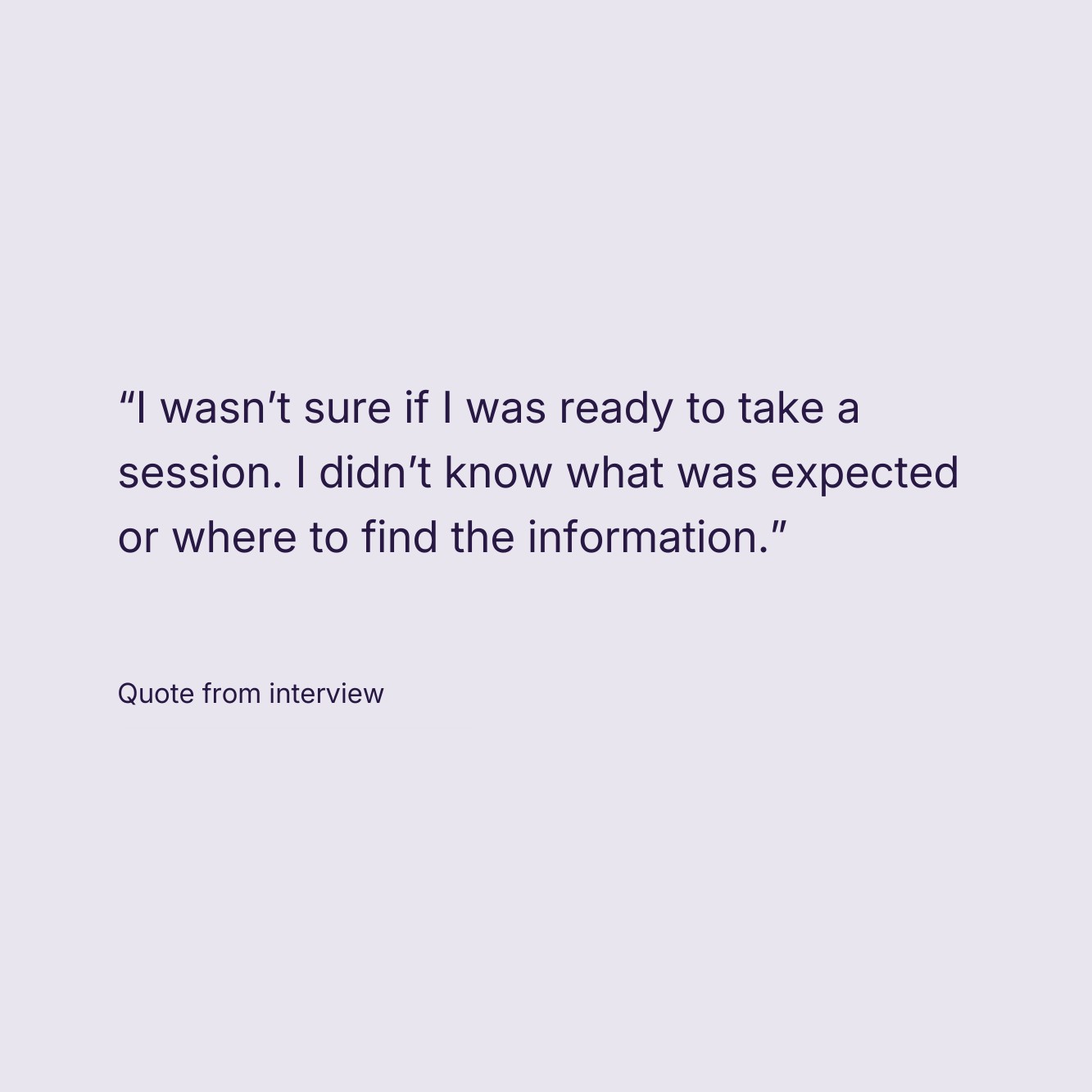
- Youngsters felt unprepared They were asked to attend sessions immediately after onboarding, with little guidance on how to interact with seniors or handle real‑world situations.
- Communication gaps caused anxiety Users didn’t know who else was attending a session or who to contact if they had questions.
- Motivation existed—but wasn’t visible Almost no one knew they could earn free Google certifications via Coursera, despite this being a huge value proposition.
- Session management felt scattered Accepting sessions, checking in, managing seniors, and checking out were spread across multiple screens and felt tedious—especially on mobile.
The Design
Based on research, I anchored the redesign around four principles:
- Build trust during onboarding
- Prepare youngsters before their first session
- Make impact and rewards visible
- Increase engagement and motivation
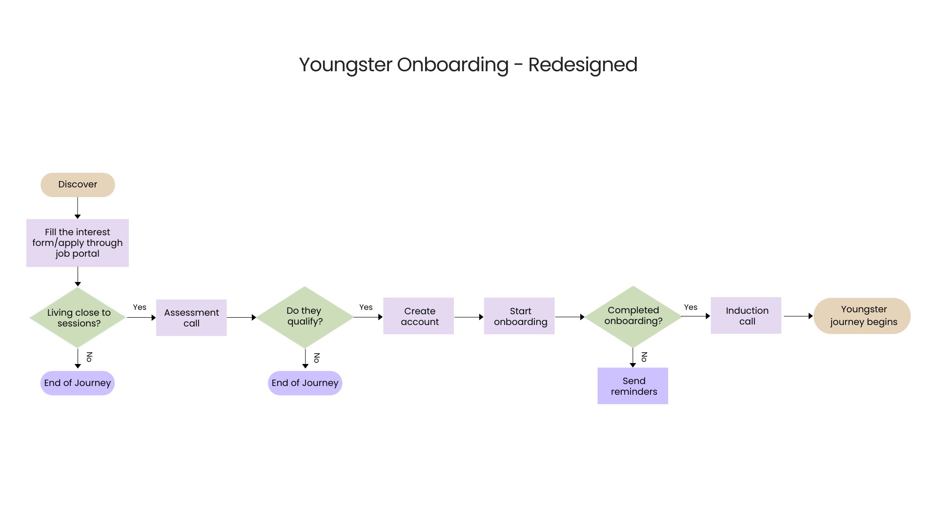
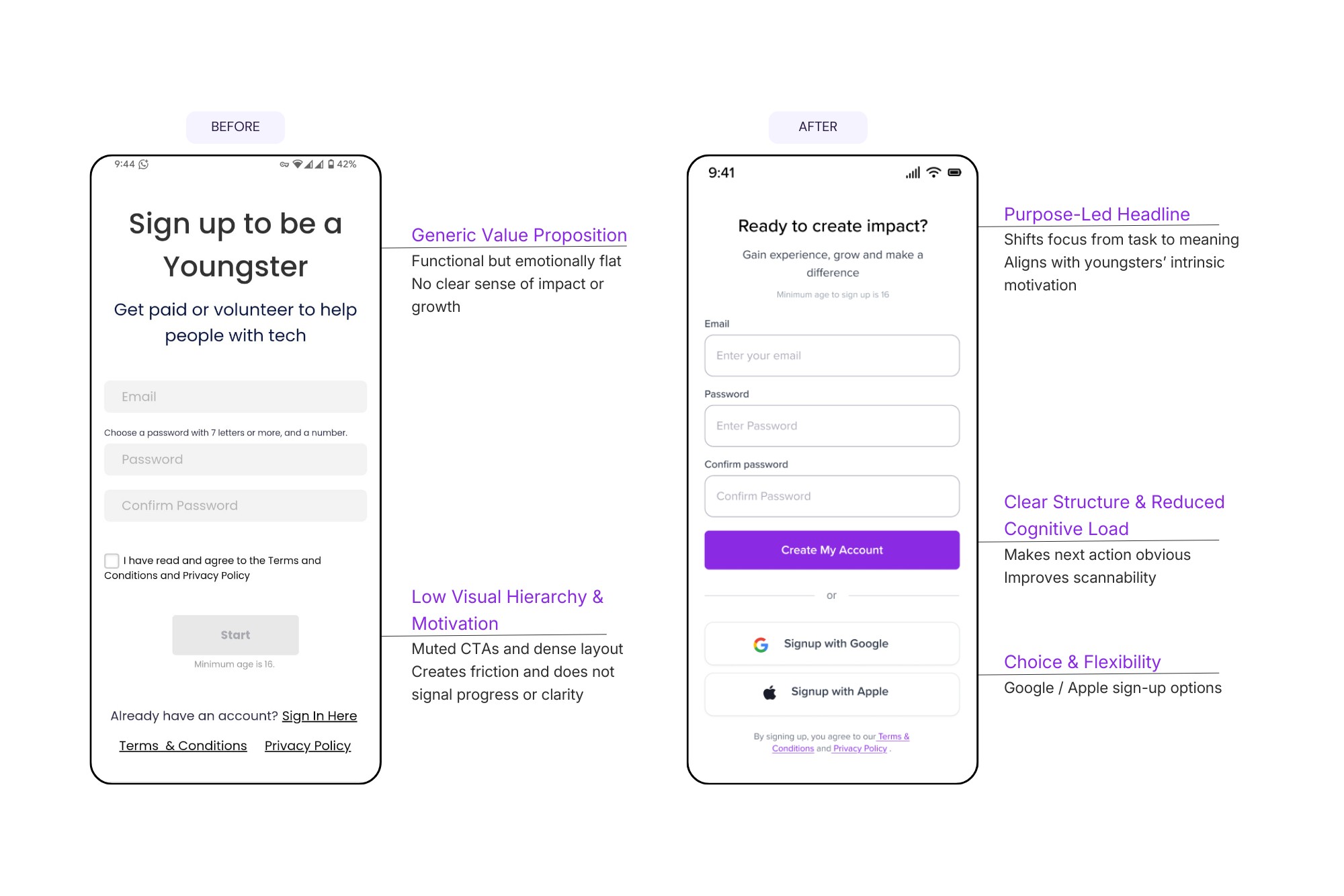
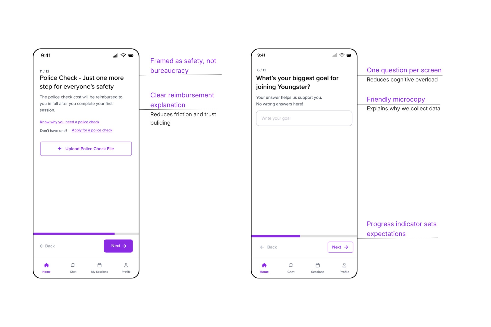
Reimagining Onboarding as a Journey
From “Why am I filling all this?”→ to “I understand what I’m signing up for and I feel ready.”
Key Changes
- Broke onboarding into clear stages:
- Application
- Orientation
- Verification (only when required)
- Removed non‑essential questions from the initial sign‑up
- Introduced one question per screen (mobile‑friendly)
- Rewrote all copy in a friendly, Gen‑Z‑appropriate tone
Human‑Centered UX Writing
Every question included a short explanation:
Why we’re asking this and how it helps you or the seniors you’ll support.
This simple change significantly reduced anxiety and built transparency.
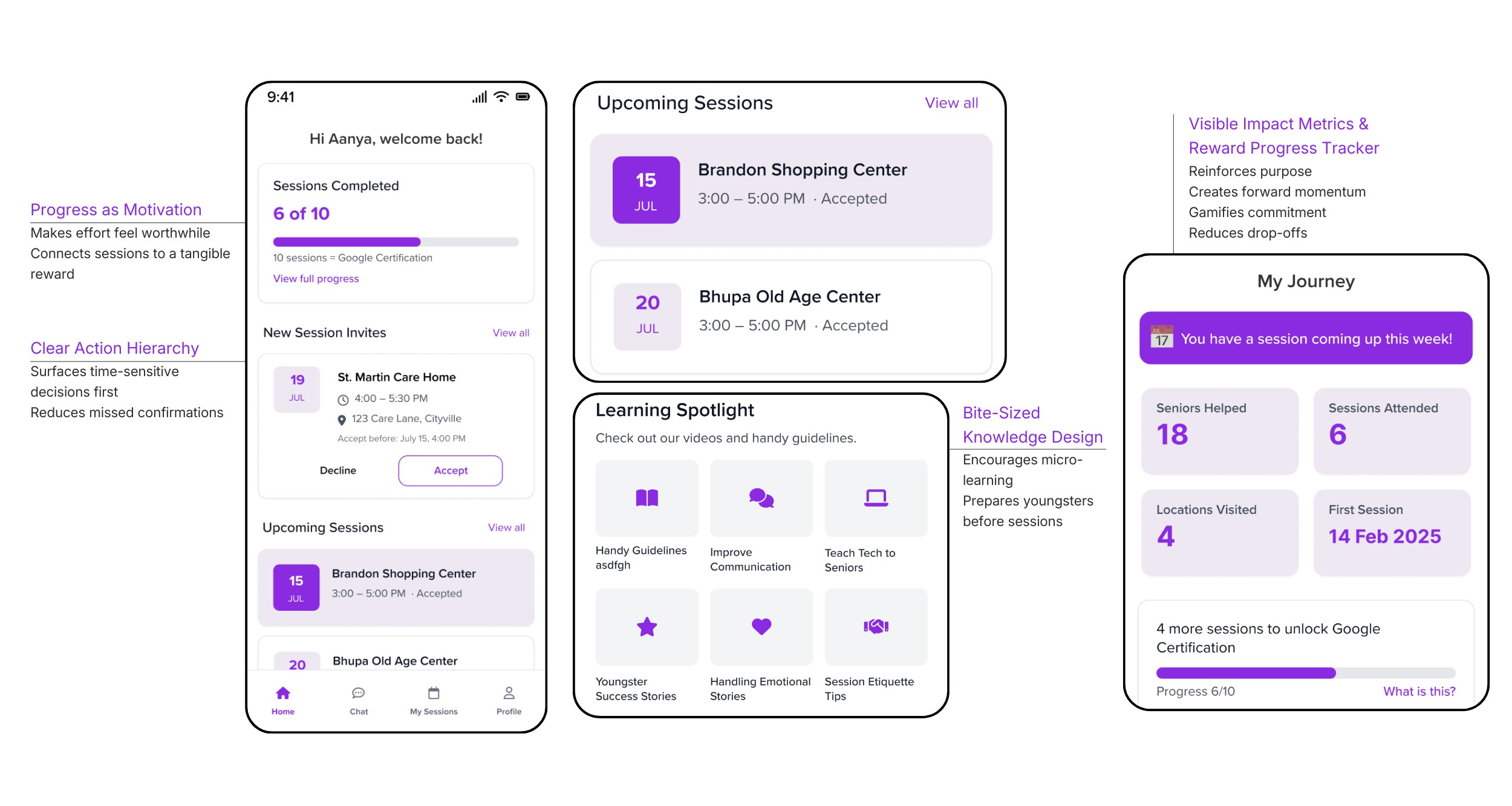
Preparing Youngsters For Their First Session
A critical insight was that reading guidelines wasn’t enough.
Design Decision
Replace long text instructions with short, actionable videos.
What I Designed
- 30–60 second videos covering:
- How to interact respectfully with seniors
- Common tech problems seniors face
- What to do (and not do) during sessions
- Videos placed directly on the dashboard for quick access
This helped youngsters feel confident—not just compliant. This approach matched Gen Z’s preference for short, visual content.
Shifted the dashboard from “What do I have to do?”
to “Look how far I’ve come.”
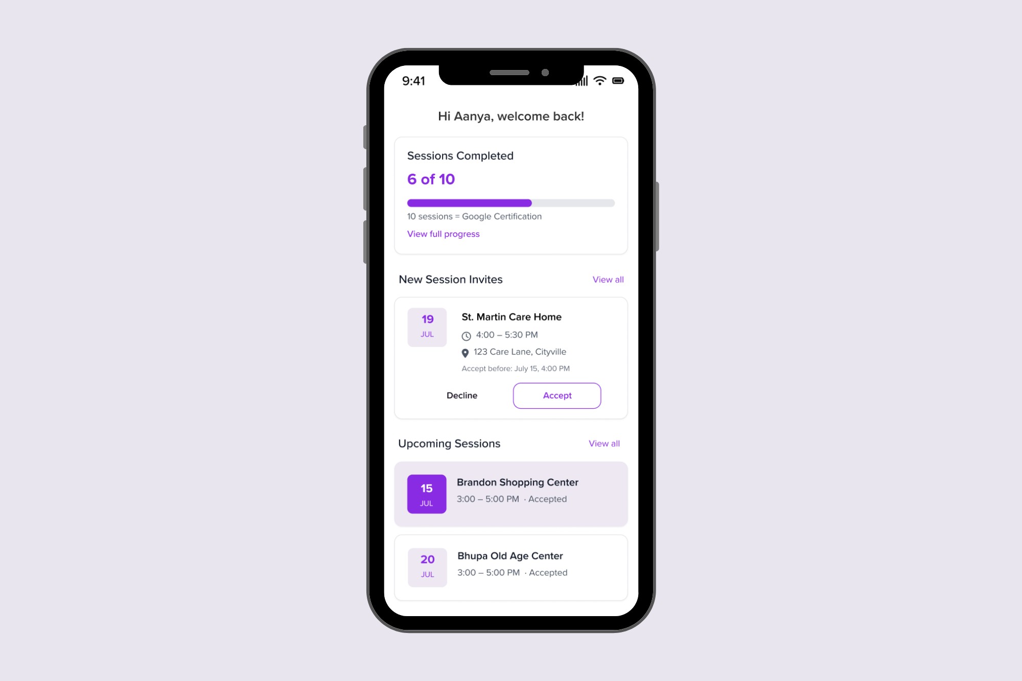
To reduce no‑shows, I reframed sessions as progress toward something meaningful. Many youngsters were unaware of incentives such as Google certification courses.
The redesigned dashboard highlights
- Sessions completed
- Number of seniors helped
- Stories showing the real impact of their work
- Progress toward free Google certifications
Design Elements
- Progress bars
- Milestones
- Clear reward messaging
This shifted the mindset from “another task” to “I’m building something.”
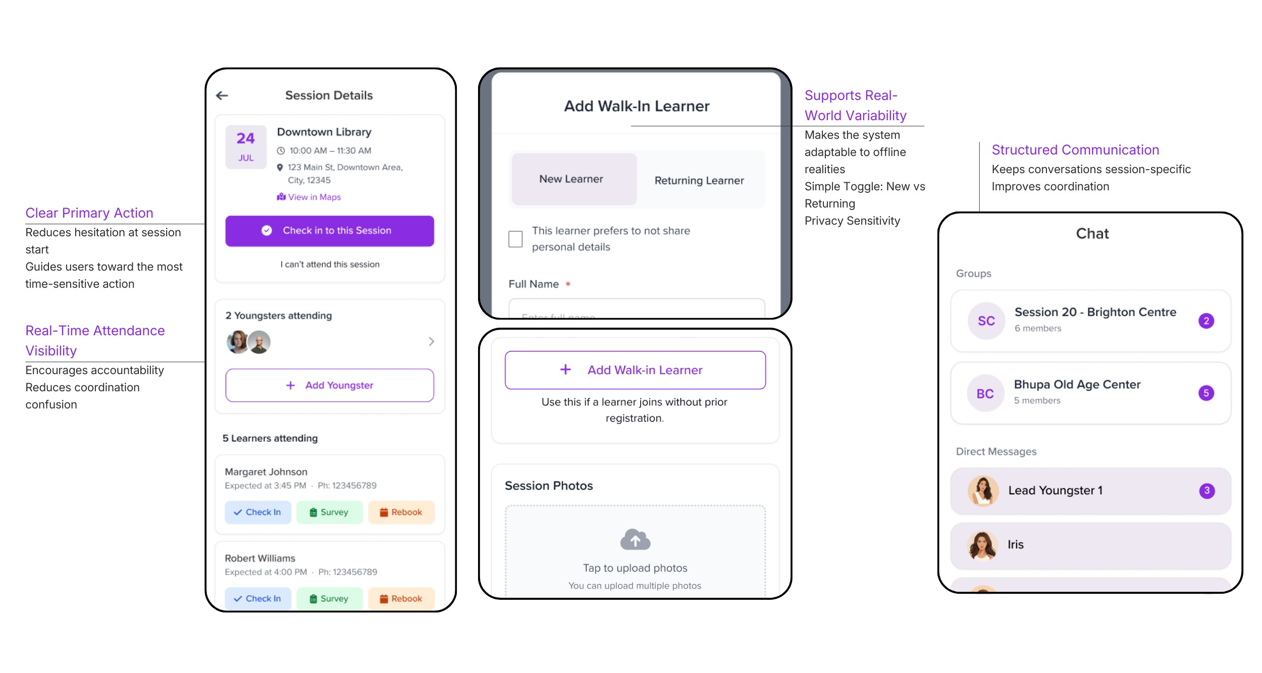
Simplified Session Management & In‑App Communication
Previously, onboarding, sessions, and communication were spread across different platforms. I proposed integrating messaging directly within the session management system to create a single, cohesive experience.
Session Management
All session‑related actions were brought into one clear flow:
- Accept / decline sessions
- View session details
- Check in / check out
- Manage seniors during sessions
In‑App Chat
- See who is attending a session
- Ask questions beforehand
- Coordinate easily
This increased accountability and reduced friction.
AI-Assisted Design Exploration
To accelerate early design exploration, I used AI tools such as ChatGPT and UXPilot to generate initial layout structures and explore different session management flows.
This allowed me to rapidly iterate on concepts and spend more time refining the final user experience.
Testing & Validation
Design decisions were continuously validated through:
- Feedback from youngsters
- Reviews with the founder
- Iterative refinements based on usability concerns
The final designs addressed the core reasons behind drop‑offs and no‑shows.
Retrospective
• Validate assumptions through real observation
Experiencing the onboarding journey firsthand revealed trust and preparation gaps that were not captured in documentation.
• Design for adaptability
Midway through the project, the scope shifted from web to mobile. Designing modular flows allowed the system to adapt without rebuilding the entire experience.
• Prioritise core value over polish
With limited time after the scope change, I focused on the most critical user flows instead of visual refinement.
• Next step
With more time, I would conduct structured usability testing on the mobile flows before implementation.
Soumya SUBBIREDDY
Home
About
Youngster.co
Empowering young people through meaningful tech-enabled work
How a redesigned onboarding & session management experience helped young people show up, feel prepared, and stay motivated while supporting seniors with technology
Youngster.co is a social‑impact platform that connects college students and early‑career youngsters with seniors who need help navigating the digital world. While seniors gain confidence using technology, youngsters build job‑ready skills, confidence, and earn while studying.
In this project, I redesigned Youngster.co’s onboarding and session management experience—initially for web, later pivoted to a mobile‑first app—to reduce drop‑offs, improve preparedness, and increase session attendance.
Role
UX / Product Designer
Duration
2 months
Location
Melbourne, Australia
Methods
User interviews, contextual inquiry, field observation, UX audits, journey mapping, information architecture, interaction design, UX writing
Key Deliverables
- Onboarding redesign
- Session management system
- Messaging integration
- Mobile-first design
User Impact
- Clearer onboarding reduced confusion and improved trust.
- Youngsters now understand expectations before attending sessions.
- Bite-sized preparation content makes it easier to support seniors confidently.
Business Impact
- Better preparation reduces session cancellations.
- Highlighting incentives increases motivation and engagement.
- Integrated messaging simplifies coordination between teams.
Problem
Onboarding Was Breaking Trust
Youngsters struggled to understand how the platform worked before joining their first session.
Key issues included:
- The onboarding form asked for sensitive information (police check, address, personal details) before explaining why it was needed.
- The onboarding presentation was long and difficult to retain.
- New volunteers attended sessions unprepared.
- Communication and session management were fragmented across multiple tools.
For a user who is just exploring whether this opportunity is right for them, this created friction, anxiety, and fatigue
Research & Insight
What I Did
To understand the challenges firsthand, I went beyond the project brief and experienced the full journey myself.
- completed the entire onboarding process as a user
- attended a real session with seniors
- spoke directly with youngsters about their experiences
This helped me identify pain points that were not visible in the original brief.
What I Learned
- Youngsters felt unprepared They were asked to attend sessions immediately after onboarding, with little guidance on how to interact with seniors or handle real‑world situations.
- Communication gaps caused anxiety Users didn’t know who else was attending a session or who to contact if they had questions.
- Motivation existed—but wasn’t visible Almost no one knew they could earn free Google certifications via Coursera, despite this being a huge value proposition.
- Session management felt scattered Accepting sessions, checking in, managing seniors, and checking out were spread across multiple screens and felt tedious—especially on mobile.
The Design
Based on research, I anchored the redesign around four principles:
- Build trust during onboarding
- Prepare youngsters before their first session
- Make impact and rewards visible
- Increase engagement and motivation
Reimagining Onboarding as a Journey
From “Why am I filling all this?”→ to “I understand what I’m signing up for and I feel ready.”
Key Changes
- Broke onboarding into clear stages:
- Application
- Orientation
- Verification (only when required)
- Removed non‑essential questions from the initial sign‑up
- Introduced one question per screen (mobile‑friendly)
- Rewrote all copy in a friendly, Gen‑Z‑appropriate tone
Human‑Centered UX Writing
Every question included a short explanation:
Why we’re asking this and how it helps you or the seniors you’ll support.
This simple change significantly reduced anxiety and built transparency.
Preparing Youngsters For Their First Session
A critical insight was that reading guidelines wasn’t enough.
Design Decision
Replace long text instructions with short, actionable videos.
What I Designed
- 30–60 second videos covering:
- How to interact respectfully with seniors
- Common tech problems seniors face
- What to do (and not do) during sessions
- Videos placed directly on the dashboard for quick access
This helped youngsters feel confident—not just compliant. This approach matched Gen Z’s preference for short, visual content.
Shifted the dashboard from “What do I have to do?”
to “Look how far I’ve come.”
To reduce no‑shows, I reframed sessions as progress toward something meaningful. Many youngsters were unaware of incentives such as Google certification courses.
The redesigned dashboard highlights
- Sessions completed
- Number of seniors helped
- Stories showing the real impact of their work
- Progress toward free Google certifications
Design Elements
- Progress bars
- Milestones
- Clear reward messaging
This shifted the mindset from “another task” to “I’m building something.”
Simplified Session Management & In‑App Communication
Previously, onboarding, sessions, and communication were spread across different platforms. I proposed integrating messaging directly within the session management system to create a single, cohesive experience.
Session Management
All session‑related actions were brought into one clear flow:
- Accept / decline sessions
- View session details
- Check in / check out
- Manage seniors during sessions
In‑App Chat
- See who is attending a session
- Ask questions beforehand
- Coordinate easily
This increased accountability and reduced friction.
AI-Assisted Design Exploration
To accelerate early design exploration, I used AI tools such as ChatGPT and UXPilot to generate initial layout structures and explore different session management flows.
This allowed me to rapidly iterate on concepts and spend more time refining the final user experience.
Testing & Validation
Design decisions were continuously validated through:
- Feedback from youngsters
- Reviews with the founder
- Iterative refinements based on usability concerns
The final designs addressed the core reasons behind drop‑offs and no‑shows.
Retrospective
• Validate assumptions through real observation
Experiencing the onboarding journey firsthand revealed trust and preparation gaps that were not captured in documentation.
• Design for adaptability
Midway through the project, the scope shifted from web to mobile. Designing modular flows allowed the system to adapt without rebuilding the entire experience.
• Prioritise core value over polish
With limited time after the scope change, I focused on the most critical user flows instead of visual refinement.
• Next step
With more time, I would conduct structured usability testing on the mobile flows before implementation.